
Morrison Cohen | Visual Identity
In crafting their public image most law firms coalesce around a few key attributes, showing the world a buttoned-up, tightly edited version of themselves. And for most of them, that’s a reasonable approach. But not for Morrison Cohen.
Guided by insights from Clarity, our strategic partner, Morrison Cohen chose to own the full range of their qualities and strengths: sophisticated and approachable; traditional and forward-leaning; nimble and restrained. The interplay of dichotomies inspired us to create a visual identity and website with our digital partners, Reflexions, that’s attention-getting, vibrantly colorful, and as charged with energy as the New York-based firm itself.
-
A visual identity system designed to play in an urban, creative, forward-thinking world.
Leading with optimism
Each individual element in the system we created embodies the positive, high-level, yet down-to-earth spirit of the firm.
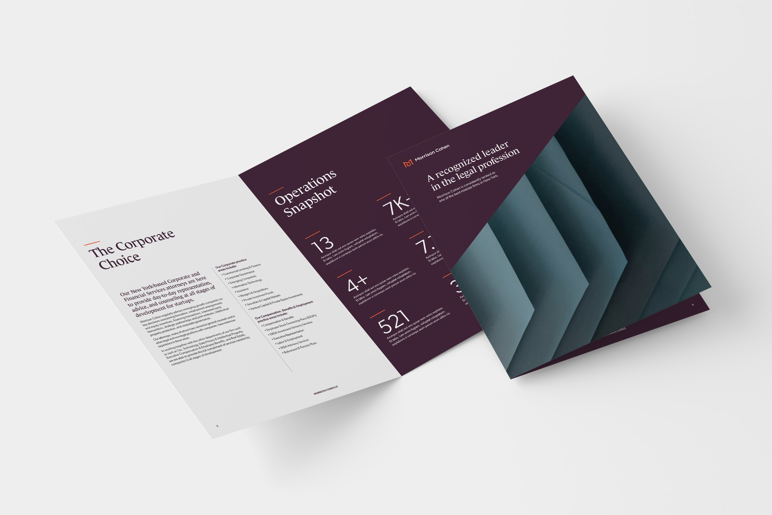
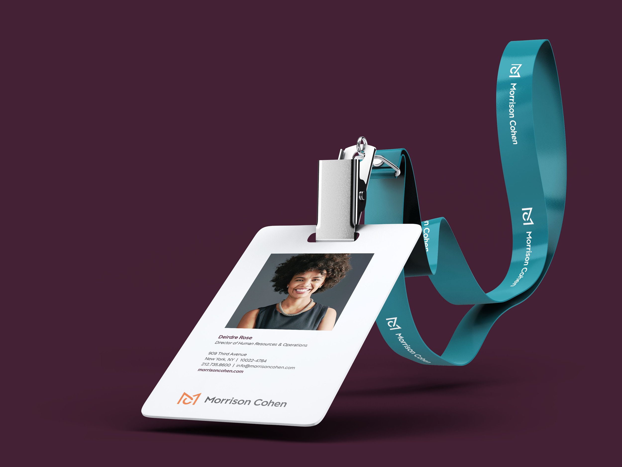
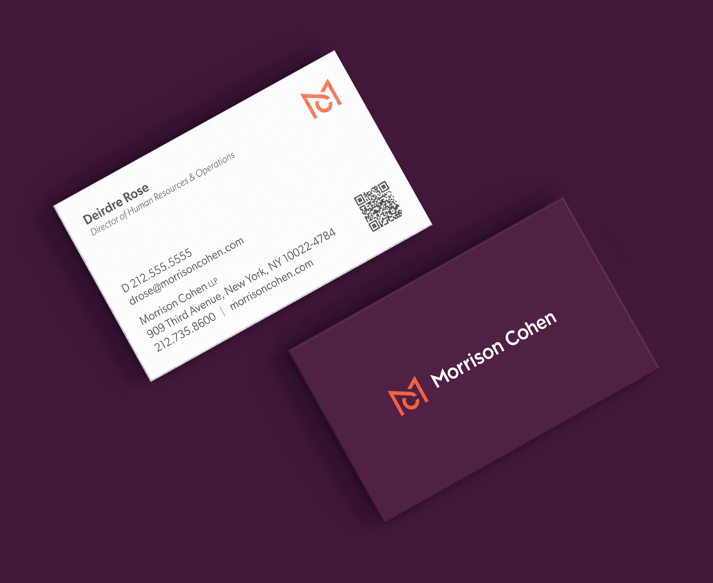
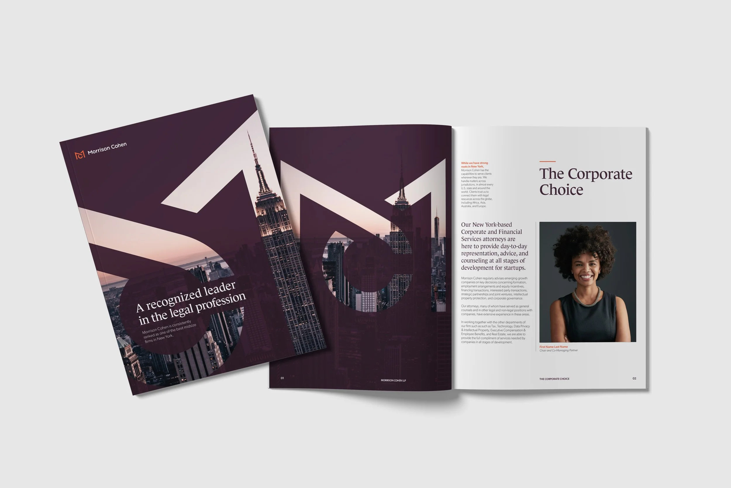
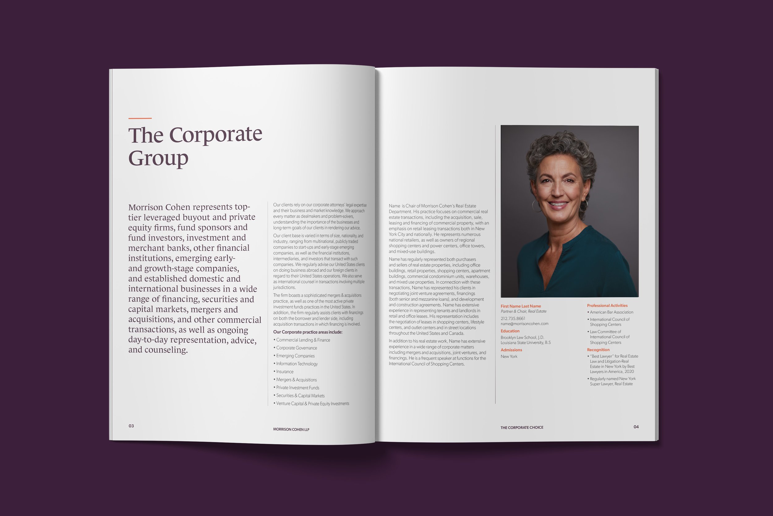
Designed to convey a sense of confidence, energy, and collaboration, the logo components can stand alone or work in “in-line” or “stacked” lockup configurations. The primary typeface, Le Monde Journal, is natural, rhythmic, and very human, with thicks and thins that reference hand-drawn letters. And the gallery-quality photography is relevant, smart, and fresh—a taste of the city at its realest and most exciting.
Proud colors
Always one of the most powerful elements of a visual identity, color is arguably the most important component of brand recognition. The palette we created for Morrison Cohen is in a different band of the spectrum than other law firms, with tones that feel both elegant and contemporary.
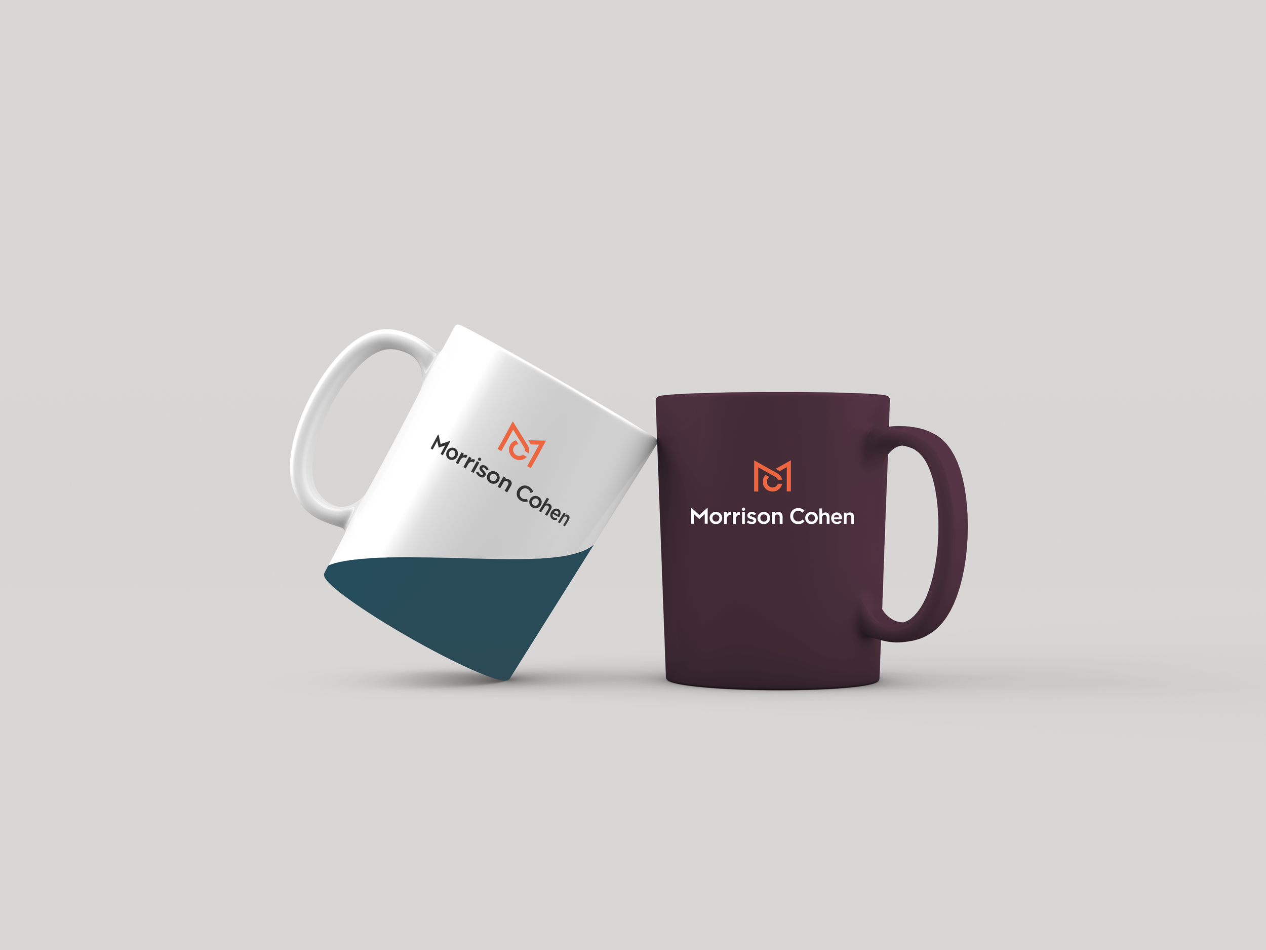
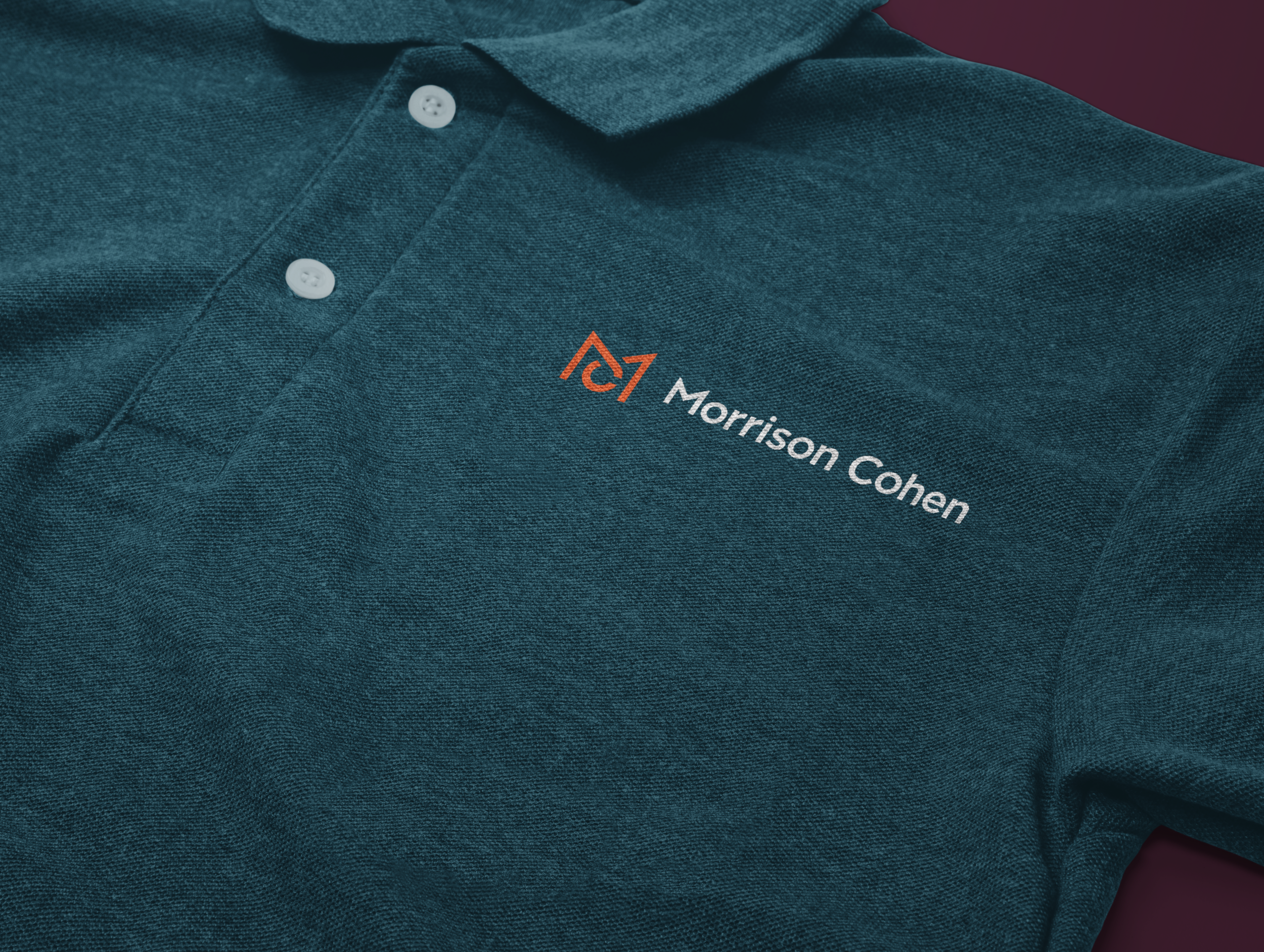
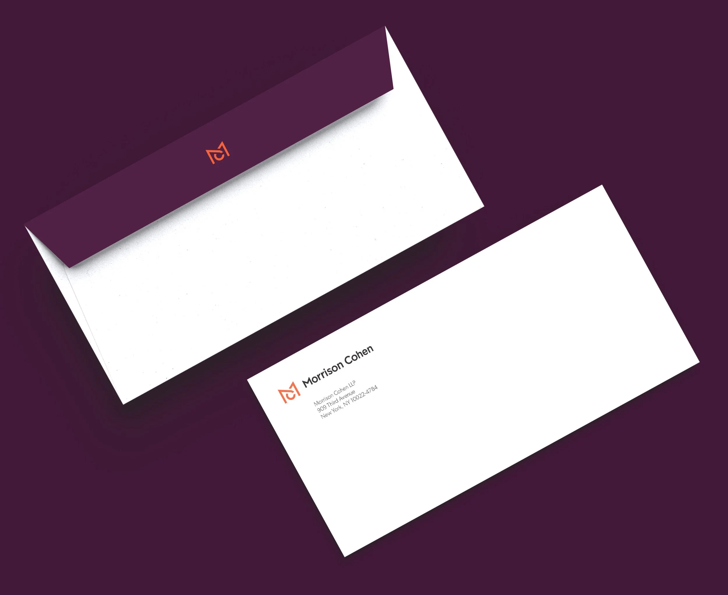
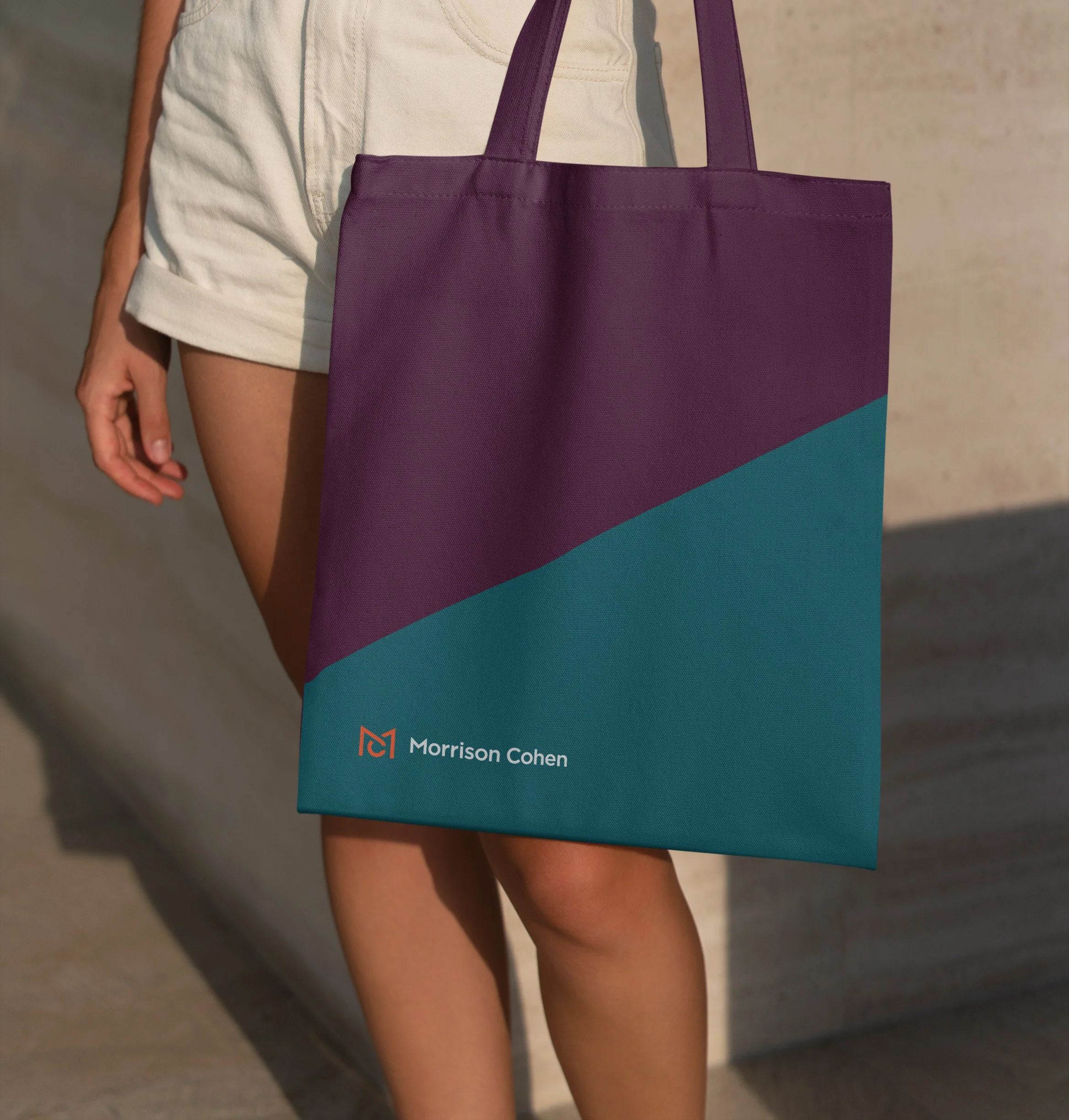
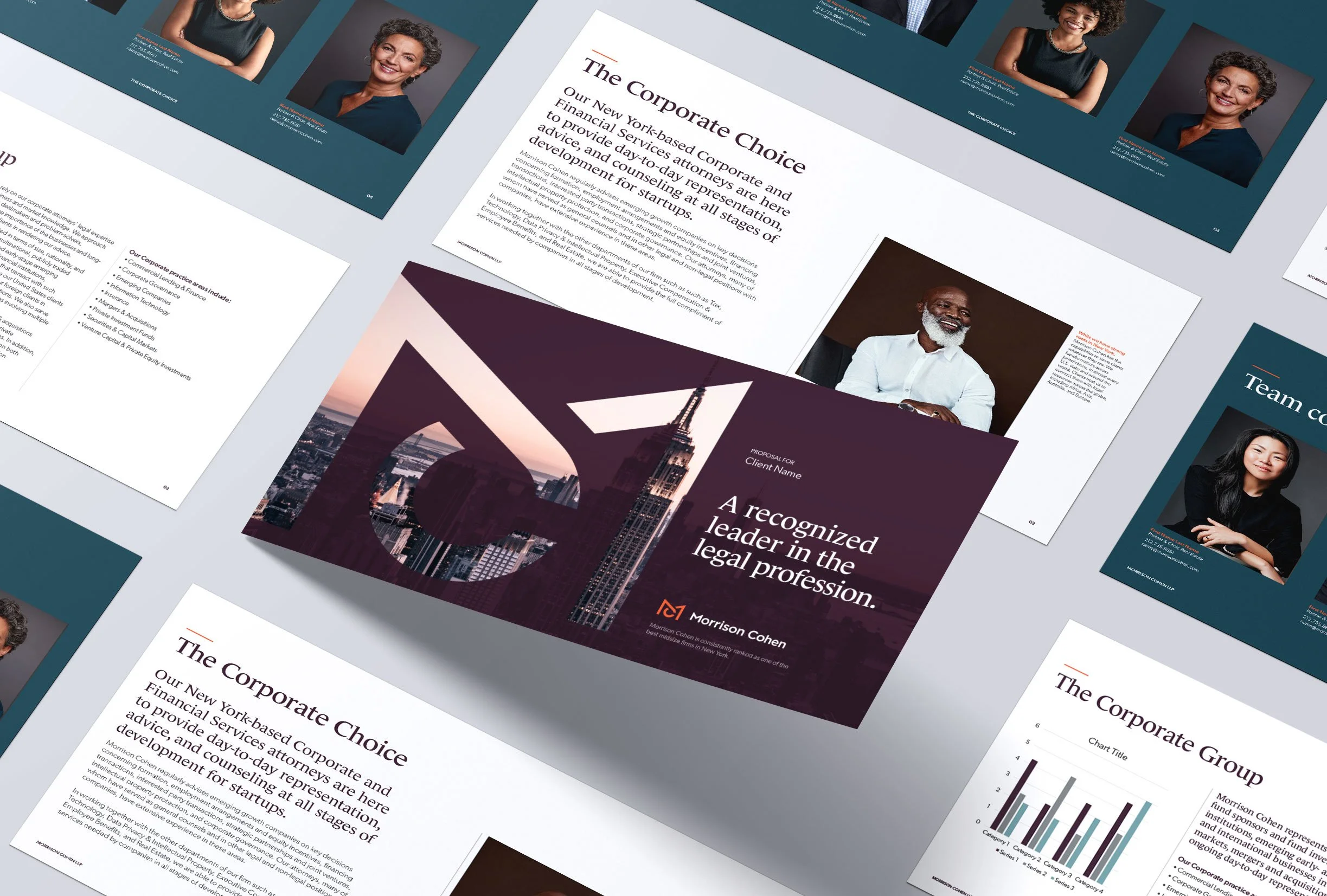
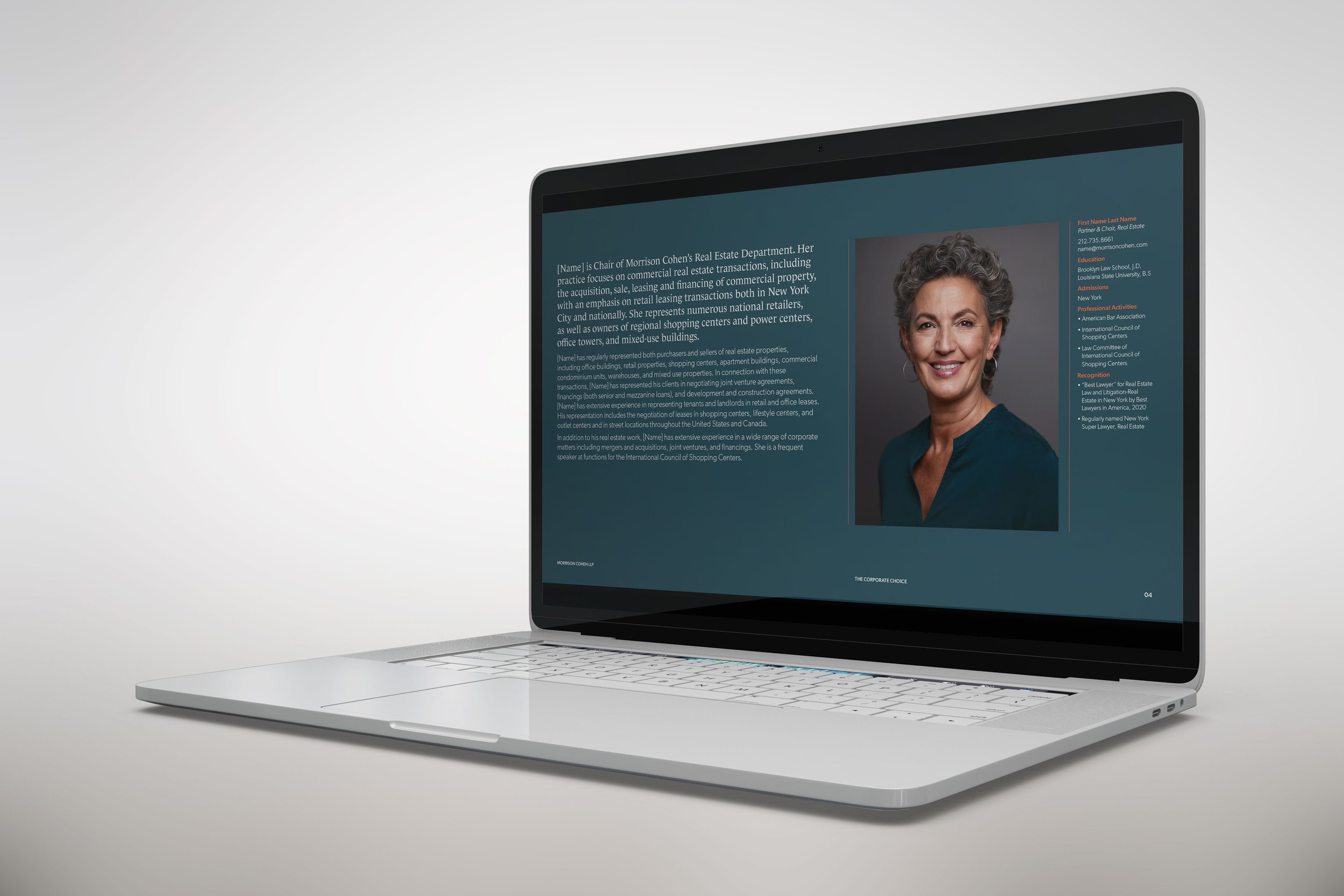
Surprising yet satisfying pairings—orange with plum, light charcoal with deep teal—communicate the contemporary, sophisticated, yet approachable vibe that resonates with this very special firm.
Modern art
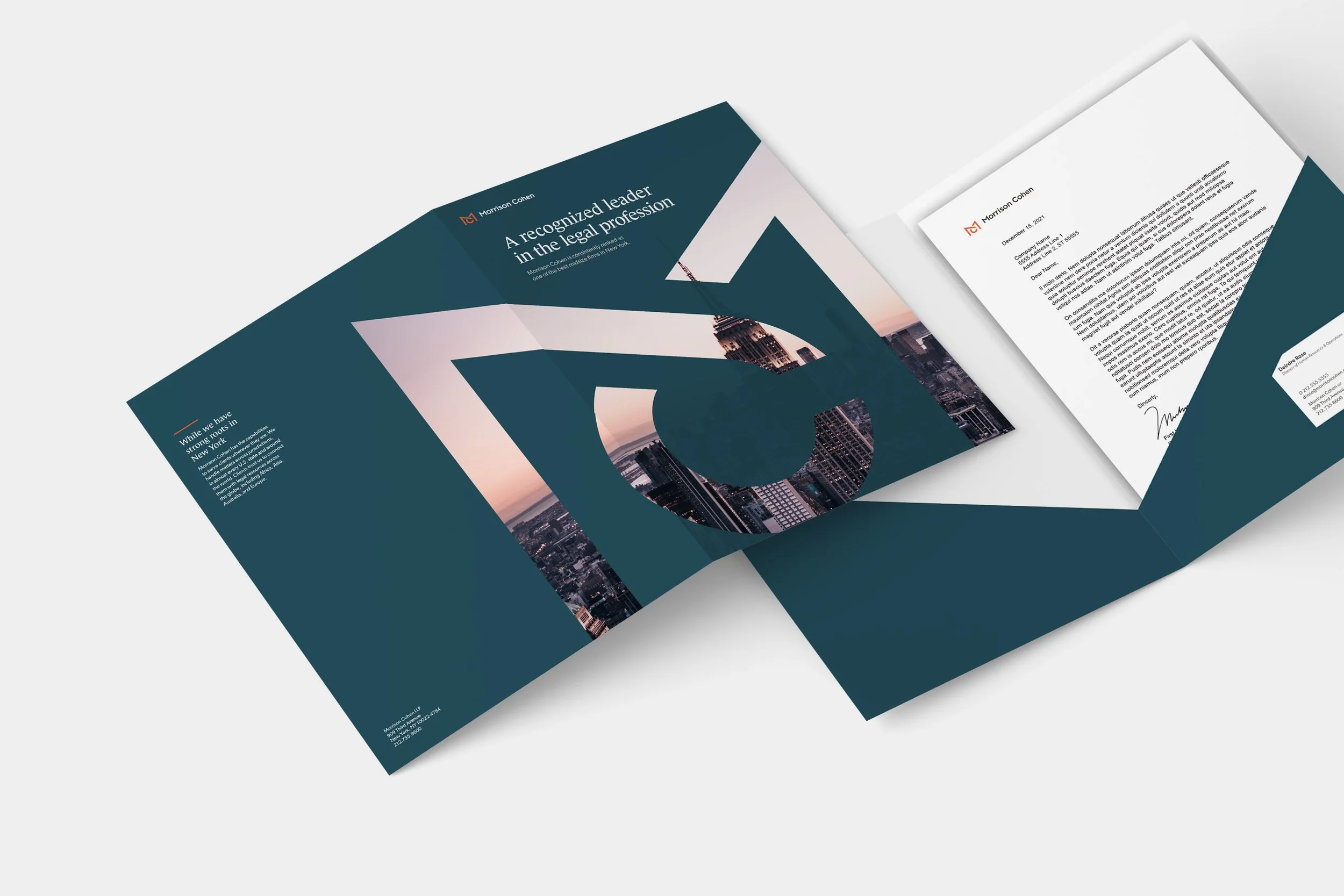
Bold and creative are Morrison Cohen core values, reflected in the graphic elements we designed. Extrapolated from the new logo, the Morrison Cohen Monogram may be applied as a positive shape to add a dynamic element to a print or web page, and makes an eye-catching “window” with background photography.
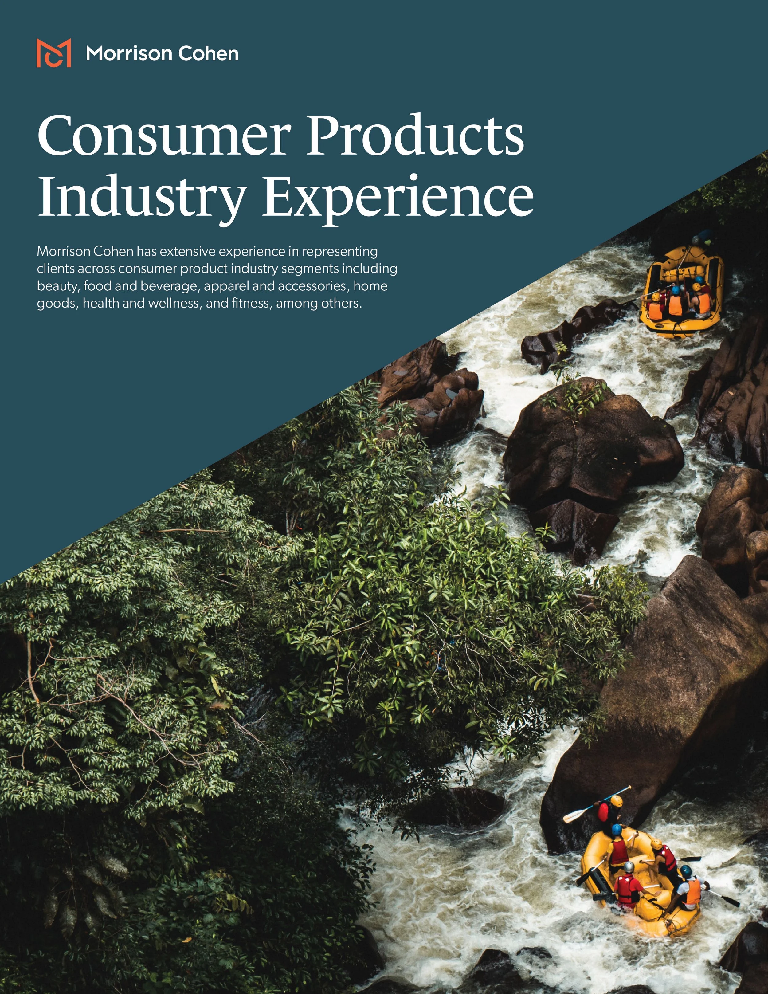
The Chisel supergraphic carves standard rectangular elements into more interesting geometric shapes and offers an excellent way to introduce our distinctive color palette onto the page.
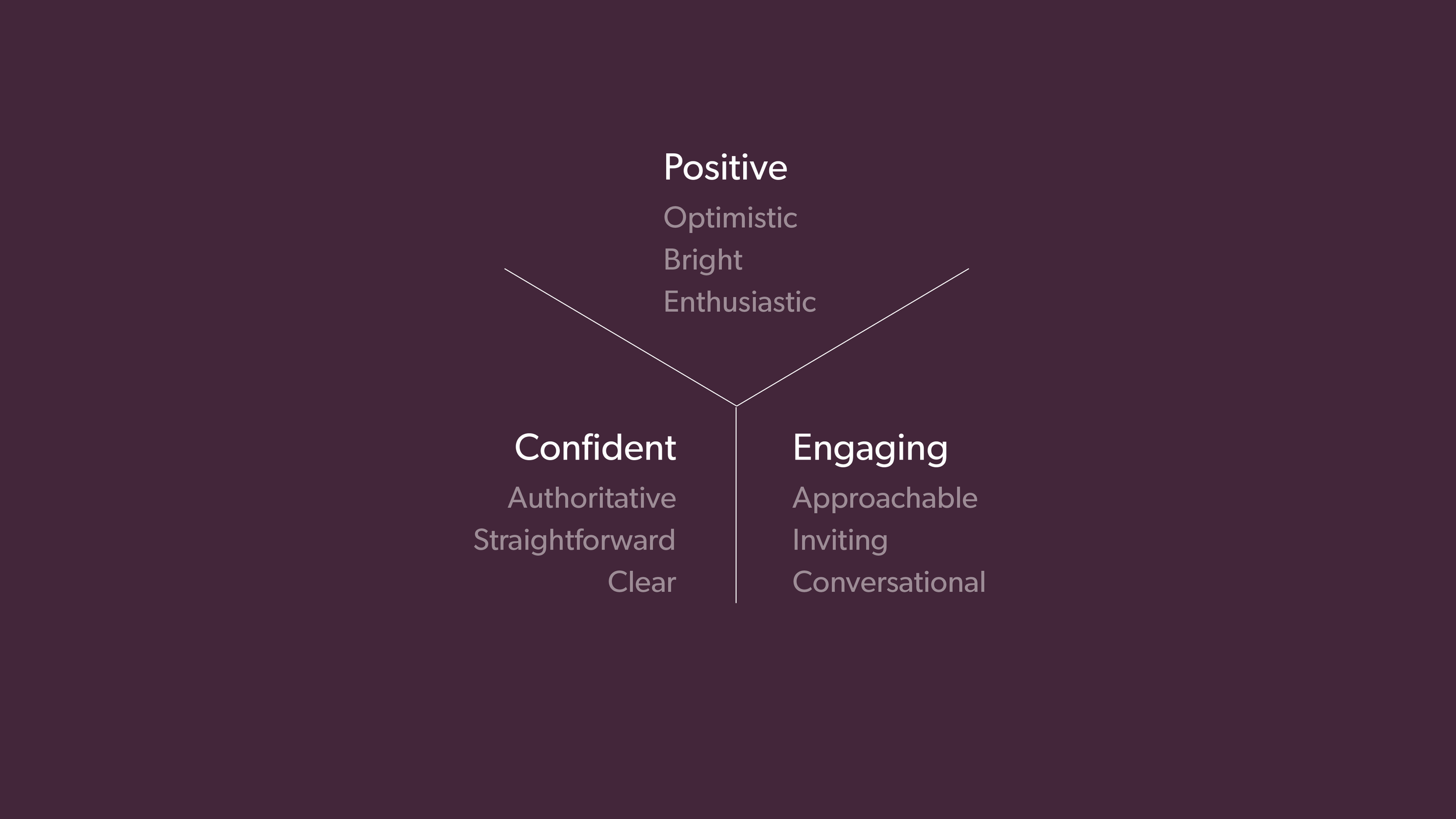
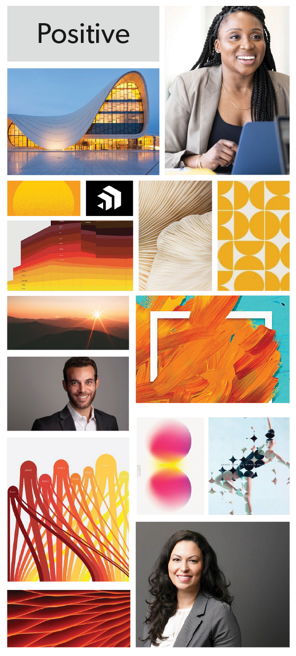
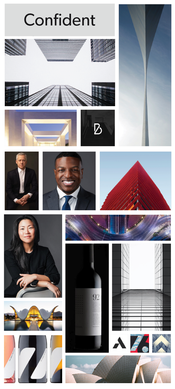
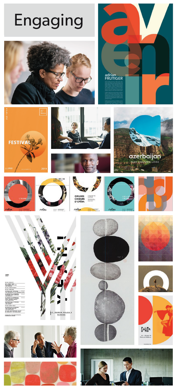
The ProcessWorking with the new research and strategy developed by Clarity Group, we were able to identify three brand tone controls attributes—Positive, Confident, and Engaging—and used them as the foundation of our creative strategy.


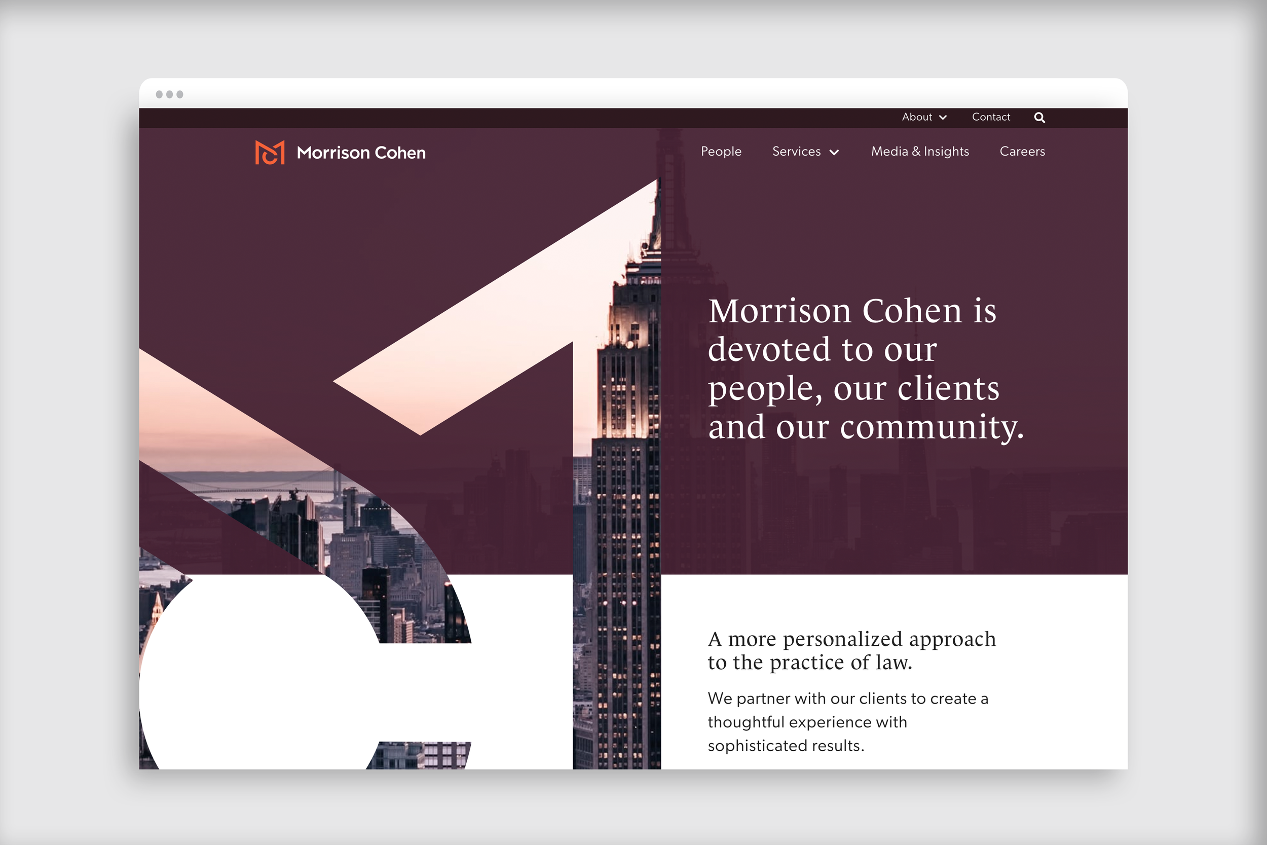
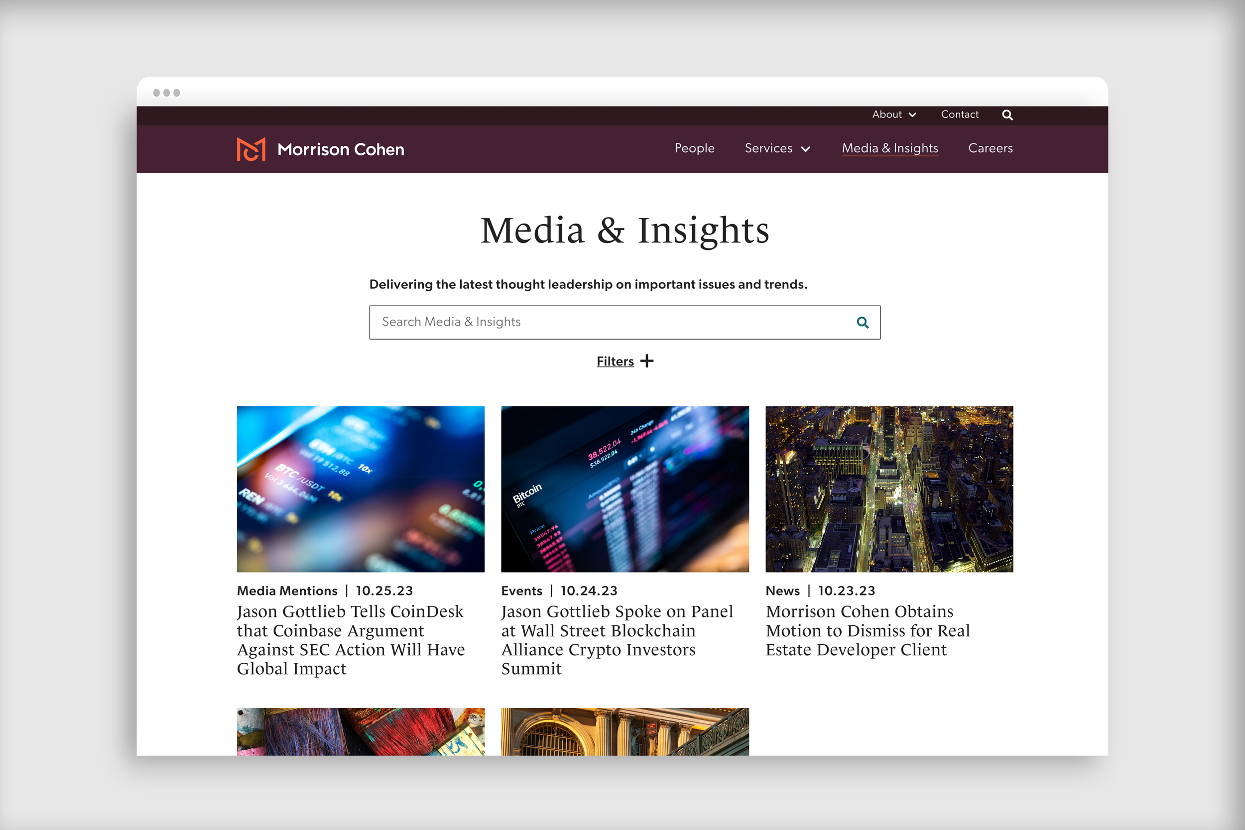
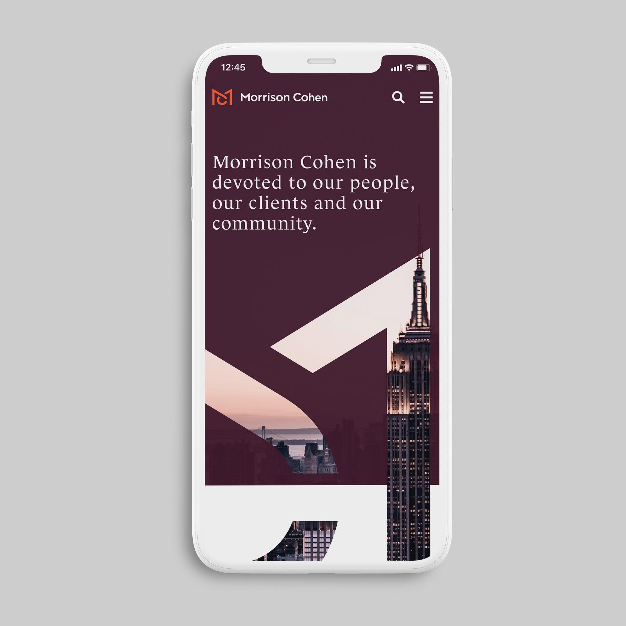
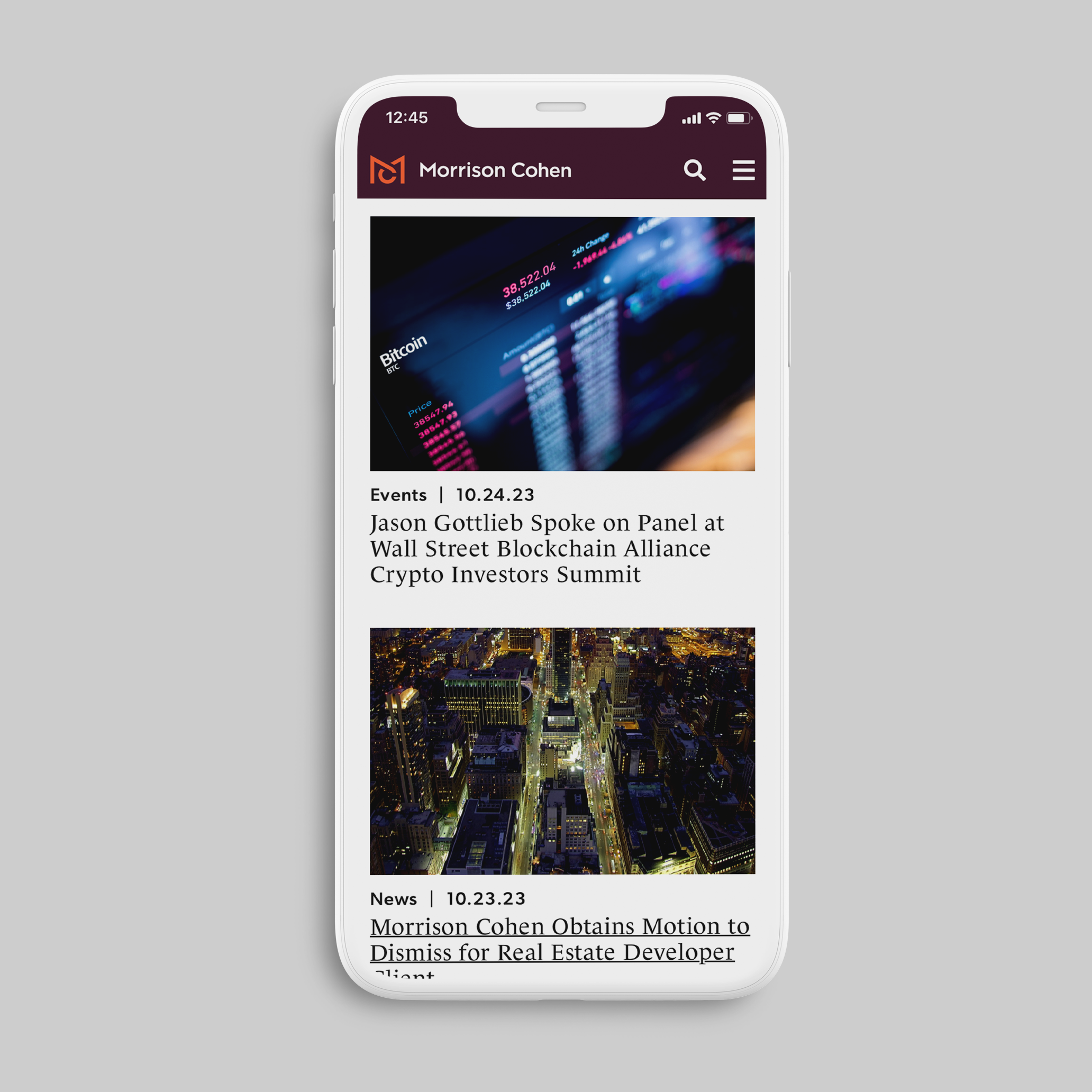


The Pensery brought to life a fresh new website with our digital partners Reflexions.